The New York Times Redesign
Self-initiated Project
2016
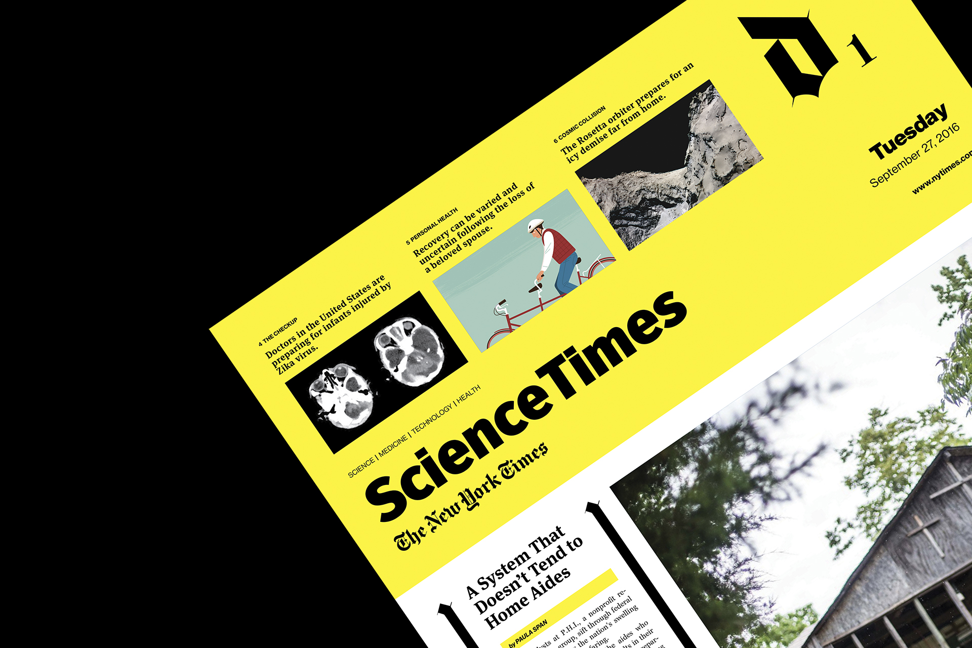
An exercise in reimagining and rebranding how the prestigious newspaper look like, how it organizes and presents its information. The approach includes taking a bold color like yellow as its masthead, allowing the paper to attract attention, then using the iconic “T” as a branding element that is regconizable while freeing up real estate for other information.
There are also other design elements like the blackletter-inspired divider, used throughout the paper, and the bold page number/section divider up top that ties together the entire paper and make it all cohesive.
There are also other design elements like the blackletter-inspired divider, used throughout the paper, and the bold page number/section divider up top that ties together the entire paper and make it all cohesive.
 Front Page
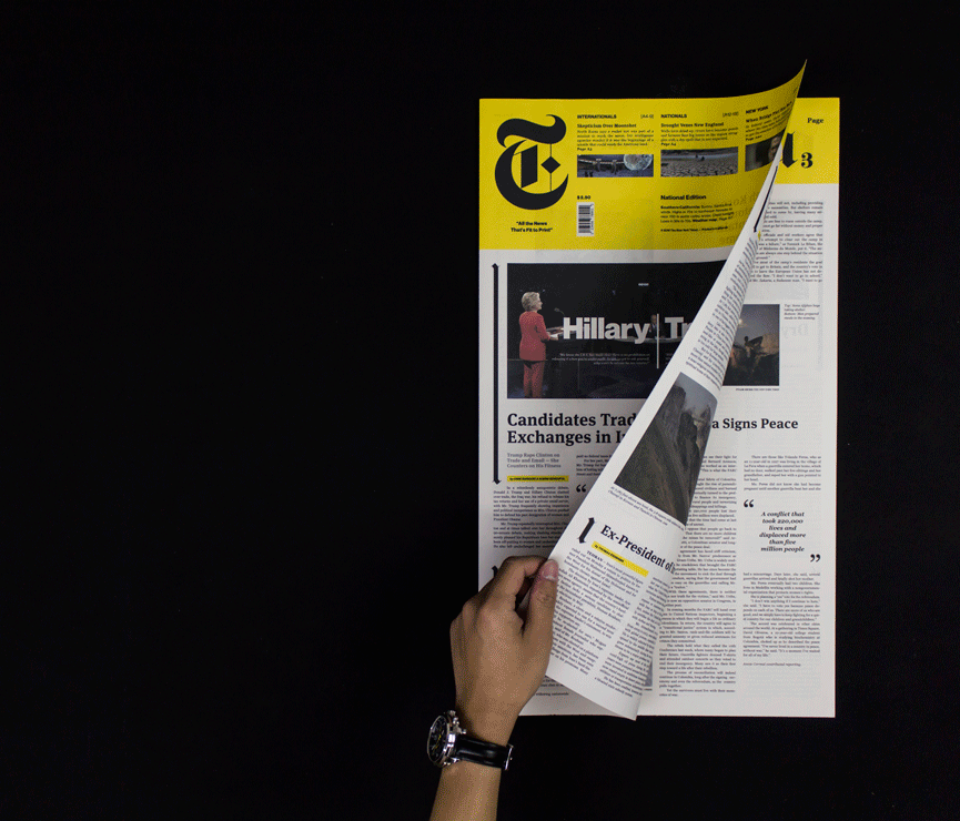

 Section B - Business
 Section C - Arts
 Section D - Science